Contributions:
• Established the project’s visual direction by researching references, creating mood boards, and setting a consistent tone
• Designed and illustrated characters with an emphasis on personality, narrative fit, and gameplay readability
• Expanded the world’s lore by developing a fictional in-game brand identity, including logos and signage
• Unified the project’s look by inking, coloring, and refining sketches from the art team to maintain stylistic consistency
Concept Art
At the start of the process the team threw around ideas, one of the things that stuck was the idea of "guiding souls to the afterlife". This idea snowballed into an idea we really liked: The player takes the role of a courier in a soul-delivery company, ran by Death.
The Boy
The world of the game met an interesting intersection between "dull, grey, bureaucratic office" vibe and a grim-yet-melancholic vibe of the afterlife. Making the protagonist a grumpy teenager tied it all together into a believable, established world that he takes a small part in.
The main inspiration came from Dragon Ball Z, where the workers of the afterlife are still all dapper in suit, tie, and horns while doing paperwork.
Starting off with a regular postman outfit, the main character rocked a white shirt with a tie and shorts. But to drive further the idea that he's related to "afterlife business" the shirt turned into a poncho resembling a classic ghost silhouette.
The first few sketches had hands, regular shoes, and a messenger bag. However, since the hands don't serve any function in the game they were dropped out of the design. The messenger bag was universally loved by the team, but being short on time the animator didn't have time to animate its movements, so it was sadly dropped out of the final design as well.
However, after getting the character into the game, we realized that a regular walk cycle would look and feel choppy and rough, while we aimed for a smoother feel. So an idea came up to throw in rollerblades, which works perfectly for the character and became a staple of its design.
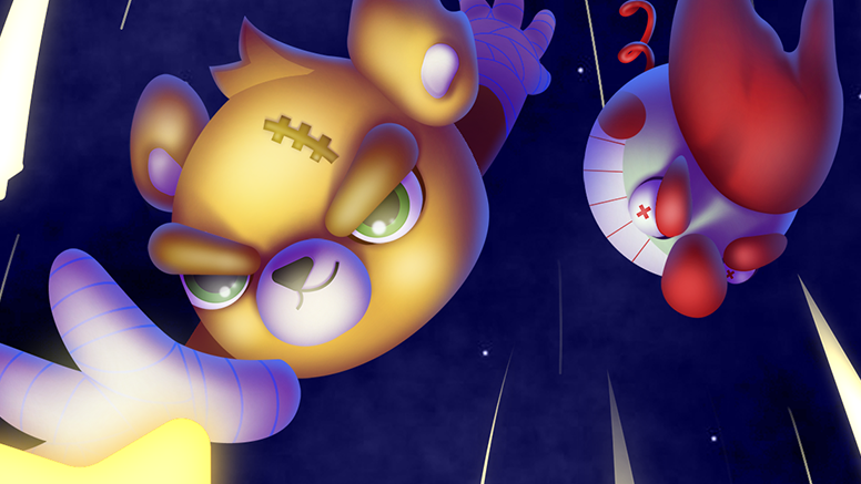
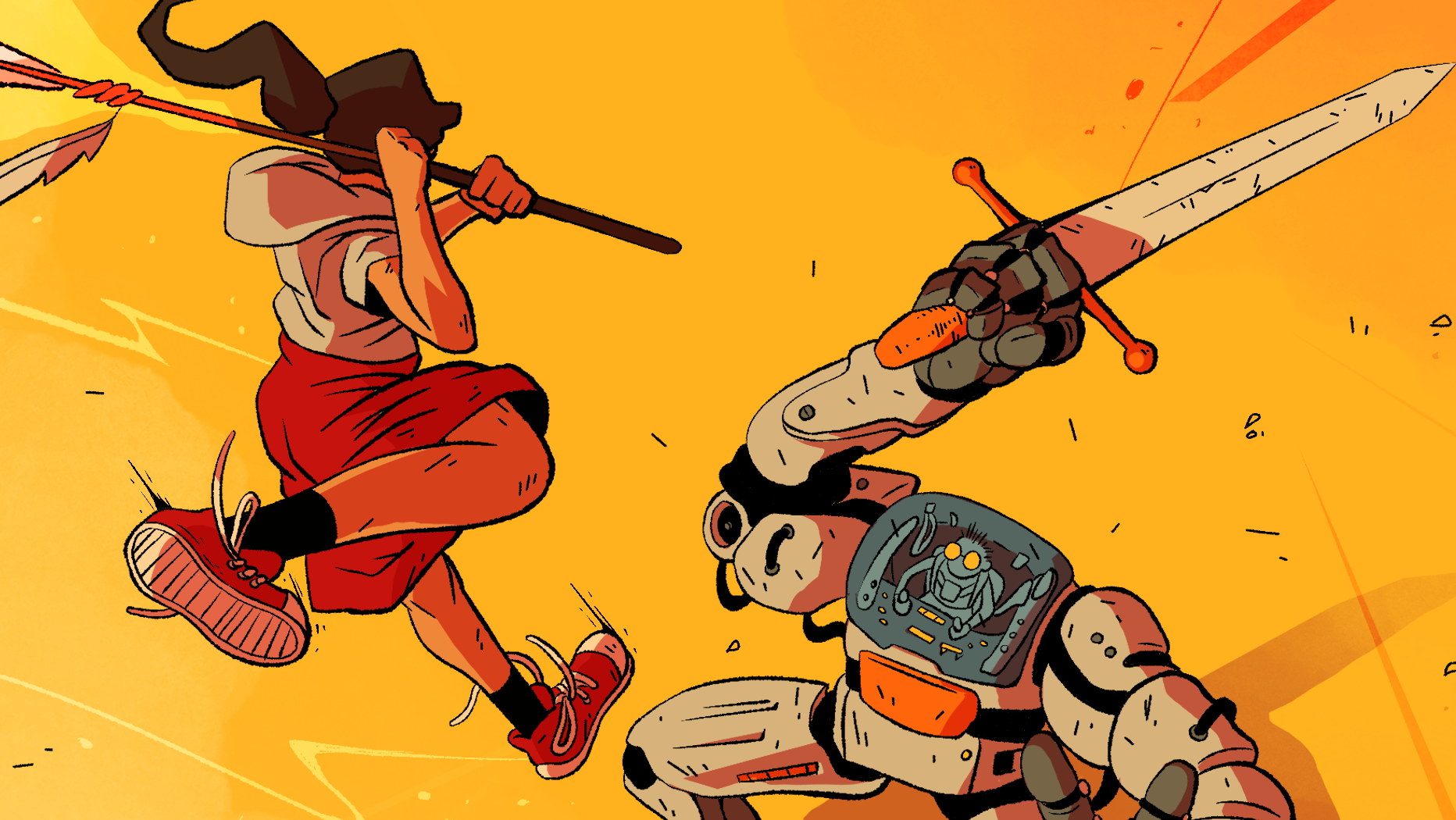
Early key art. Done to convey the atmosphere of the game and general look of the gameplay.
The BOSS
Establishing that the player works for an afterlife company, it seemed appropriate that the boss is none other than Death.
Initial ideas leaned into the classic "boss" character — a cartoonishly evil businessman. But to push the theme of the game further, the idea came up to use the classic skeleton-in-robe Grim Reaper, though now he's just an old nagging and grumpy boss with tiny glasses, scrambling with paperwork while taking calls.
WORLDBUILDING
The COMPANY
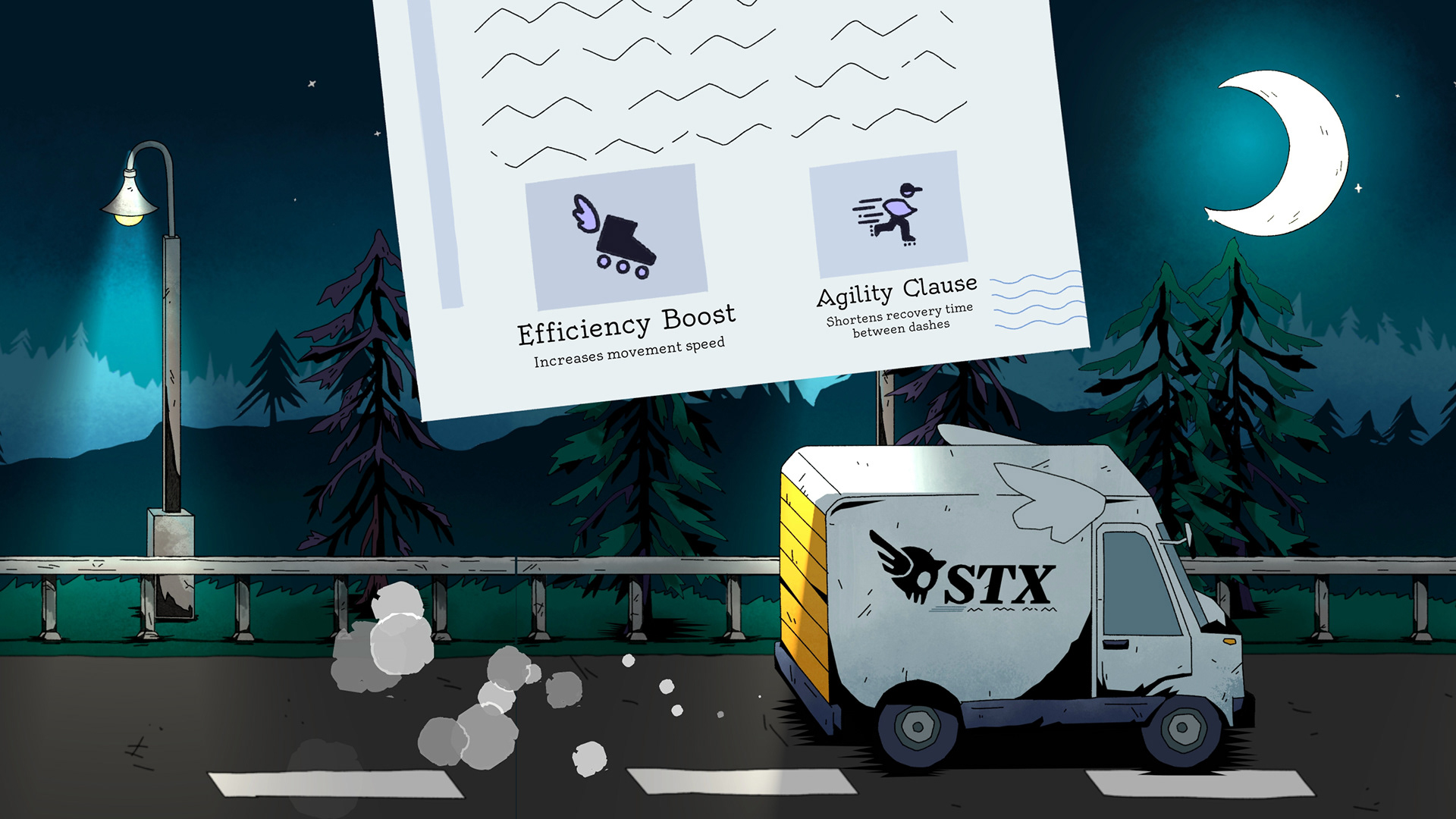
We had our protagonist, we had our boss, but we needed to establish the actual workplace and company they work in. Using acronyms was a no-brainer to convey a dull, bureaucratic, logistics-type of company. At first we threw around random letters that looked nice bunched together, but a brilliant team member suggested STX – a play on the name Styx, referencing the Greek goddess and river of the underworld.
Similar to the protagonist's outfit – The design language of the company draws inspiration from both post office aesthetics and general logistics companies.
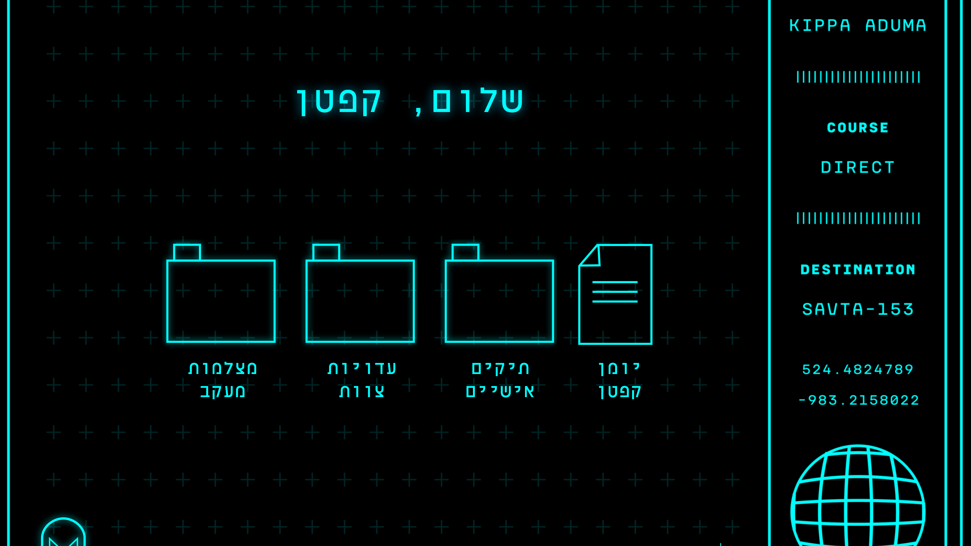
While coming up with the "store" feature that occurs between levels, we figured we can use that time to showcase the world of the game: The player is in the truck that picks and drops them at every level, gets a call from the boss, and picks an upgrade for the next level by signing on a new clause in their employment contract.
A feature that is essentially "choose an upgrade" turned into both relaxing downtime from gameplay and a way to tie the corporate theme together.
WORLD & ENVIRONMENT
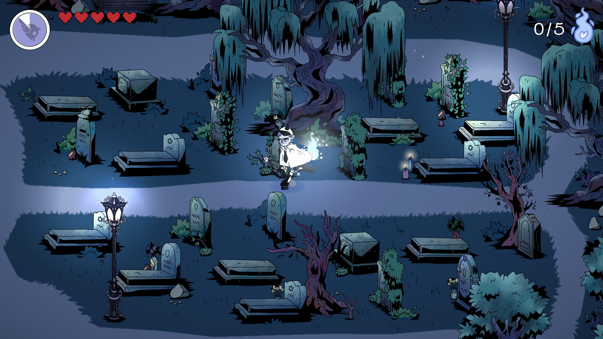
The GRAVEYARD
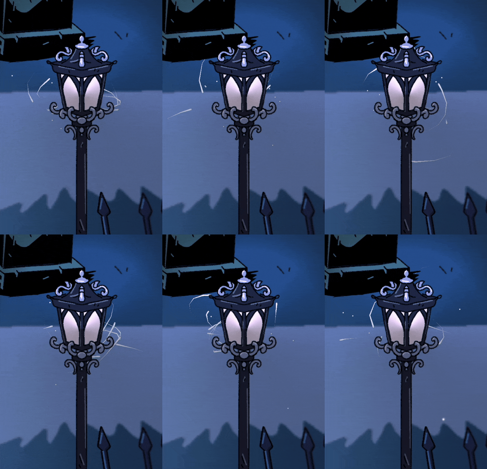
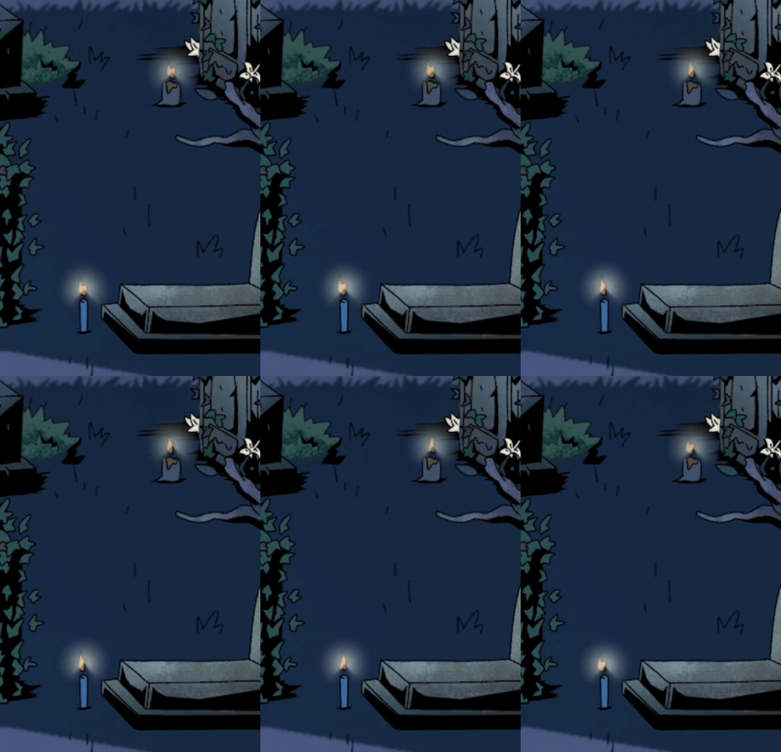
Working on the graveyard was one of our most challenging-yet-rewarding parts of the process. To make a graveyard not feel like a completely dull and depressing place takes a lot of little touches that create a beautifully melancholic and charming environment.
Luckily the team had a fantastic environmental artist who doubled as a level designer, creating assets and placing them in a way that lets players glide smoothly through the map. It also wouldn't have looked the same without the tireless work of the tech artist, who brought life to every candle, branch, and lamp on the map.
One of the fun things that happens when working on something so big is sneaking in easter eggs, like making the graveyard more relatable to our identities and adding references to our past games.

ENDING(S)
The END
The "Game Over" screen came from a fun and off-the-cuff gag. The pun of being "fired" from your job meaning to be sent to burn in hell was too good to pass.
The true ending of the game was a more cathartic piece – the shift coming to an end, the truck releasing all the souls to fly off to the afterlife as the player watches the sunrise.
Promotional
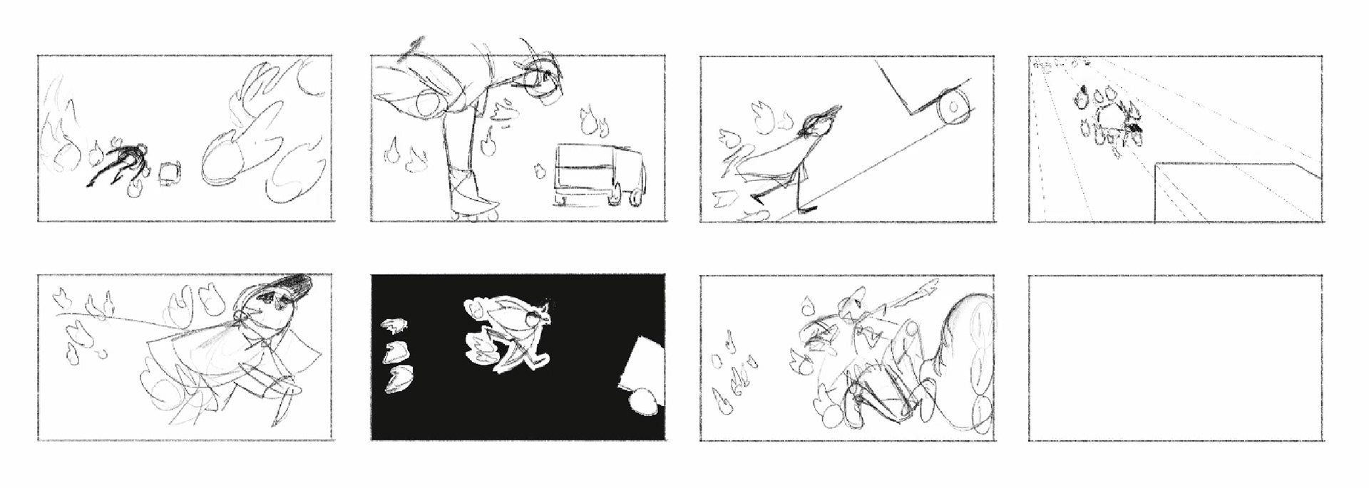
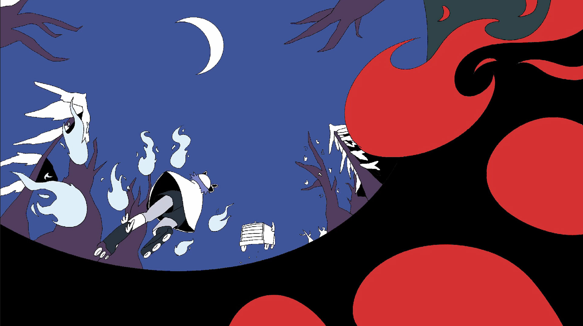
Initial sketches (left) and process (right) for the final key art
Soundtrack
We've had the pleasure of working with an extremely talented composer and sound designer on this game that brought life into every single moment with an incredible original score and sound work. We were thrilled to have the soundtrack posted up on Spotify for everyone to enjoy it as much as we did.

